←︎ All case studies
MAG Finances: Designing inside the rules
A regulated fintech product built inside Aegon Insurance. I helped adapt an inherited design system into a MAG-specific product library, while working across accessibility, user testing, banking flows, and insurance journeys.
Product Design
Design Systems
Professional
TL;DR
I was part of MAG Finances' founding design duo, helping design a fintech product inside Aegon Insurance.
My work sat between product design, accessibility, user testing, and design systems. The hard part was not making something from scratch. It was taking an inherited corporate system and making it flexible enough for a new financial product in Brazil, without making it feel like it belonged to a completely different company.
- Role
- UX Designer · founding design duo
- Company
- MAG Finances / Aegon Insurance
- Context
- Regulated fintech product inside a legacy insurance group
- Scope
- Design library · accessibility · user testing · app flows · insurance journey
- Constraint
- Inherited design system · banking rules · no ground-up rebuild
- Key challenge
- Make a group-wide design system work for banking, insurance, broker support, and self-serve flows
- Outcome
- The app moved through regulatory review with minimal design revisions and supported MAG Finances as it reached R$500M in payment transactions less than a year after launch.
This was not a startup app with a blank canvas.
MAG Finances is a fintech product launched inside Aegon Insurance (Grupo Mongeral Aegon), a long-standing Brazilian insurance group.
That mattered from the first design decision. We were not designing a playful finance app from zero, or chasing whatever fintech trend looked good that year. We were designing inside an old, trusted financial institution, with all the weight that comes with money, insurance, compliance, and people's private information.
The product included banking-like services: digital account access, prepaid cards, bill payments, TED transfers, QR Code transfers, and later Pix. It also had to connect back to insurance, which meant broker relationships, policy access, approval flows, and a lot of trust.
So the work had two jobs at the same time: it needed to feel modern enough to behave like a fintech, but stable enough to belong to a legacy insurance group.
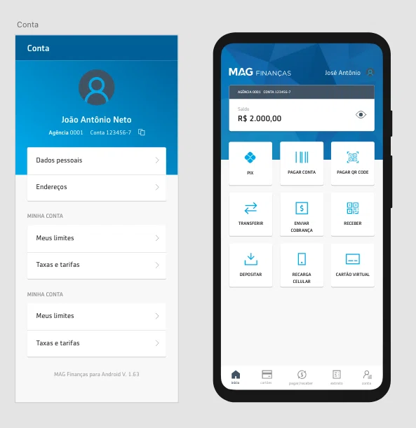
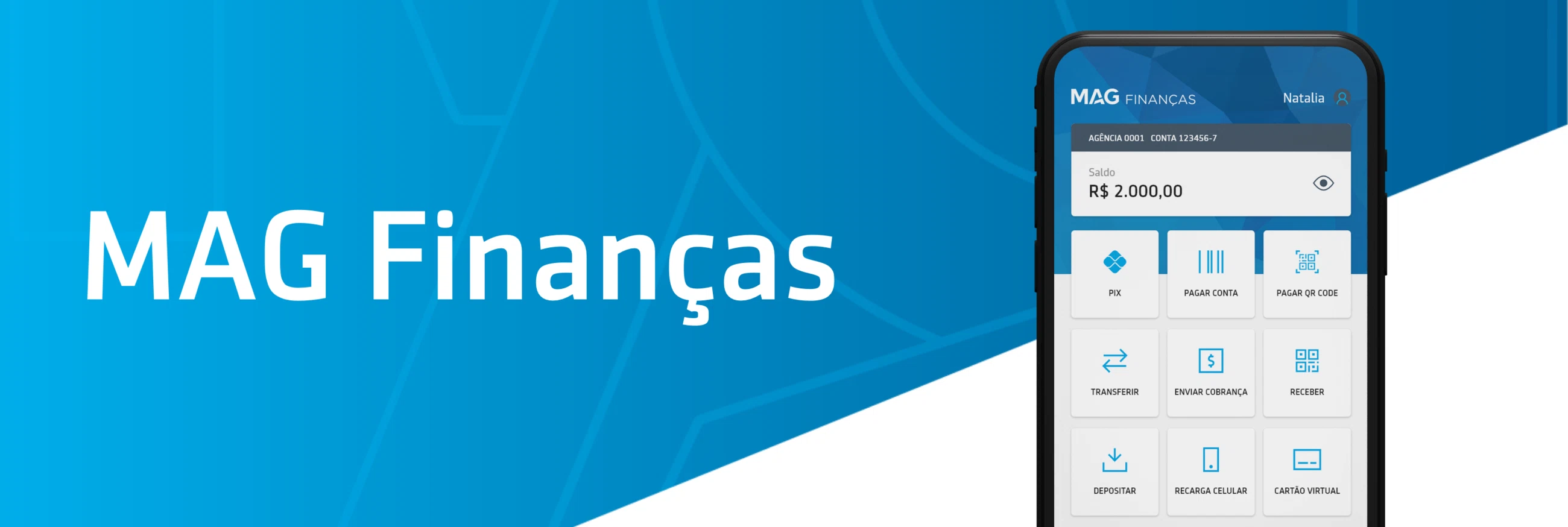
MAG Finances product screens. Everyday financial actions had to sit inside a product that still carried the trust and responsibility of an insurance group.
We had a system. It just was not built for this.
The visual foundation already existed. Aegon Insurance had a group-wide design system, and our job was not to throw it away and start over.
That sounds easier than starting from zero, but it was not. Existing components did not always cover what MAG needed, and some patterns had been created for products with very different levels of risk. A banking flow has different pressure than a content page, and an insurance flow has different pressure than a simple account screen.
A lot of the work was careful adaptation: understanding what could be reused, what needed to change, and where changing too much would break consistency with the broader group.
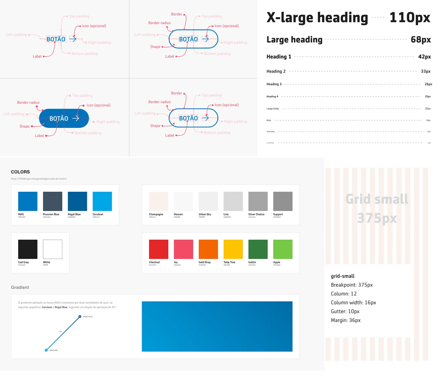
Life Design System, the shared foundation across Aegon group products before MAG Finances.
A living library, not a pretty sticker sheet.
I helped build the MAG-specific product library on top of the inherited system. The goal was not to make a beautiful component page and call it a day. The library had to support real product behavior: onboarding, authentication, account information, payments, policy access, broker contact, scheduling, and self-serve insurance journeys.
It also had to work with accessibility and user testing, not just visual consistency. If a component looked aligned with the system but failed when someone actually used it, it was not doing its job.
The useful part of a design system is not that it looks organized in Figma. It is that it helps the next screen make sense faster, especially when the product is growing and more people need to make decisions without reinventing the same pattern every time.
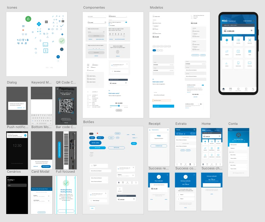
Early MAG-specific product library built from the inherited Aegon Insurance system. The work was mostly adaptation: keeping the foundation, but making it usable for Brazilian fintech and insurance flows.
Small decisions get heavier when money is involved.
Banking apps in Brazil live under heavy regulation and trust expectations. Users are moving money, paying bills, accessing account information, and dealing with insurance products, so a vague button or unclear status message is not just annoying. It can make people feel unsafe.
That shaped how we approached hierarchy, language, authentication, error states, and next steps. The interface had to make actions clear without making the experience feel intimidating, and it had to be structured enough for review without becoming rigid or painful to use.
The app was approved with minimal design revisions, which was one of the clearest signs that the system was doing its job.
The insurance flow had to make room for real people.
The insurance journey was the most complex part I worked on because it had to support people arriving from different places. Some users were existing policyholders trying to access coverage, some were new users exploring insurance, and some still needed to talk to a broker before making a decision.
That last part mattered. Aegon Insurance was not a purely self-serve business, and pretending brokers did not exist would have made the flow cleaner on paper but worse in real life. The product needed to give users more independence while keeping human support close when the decision called for it.
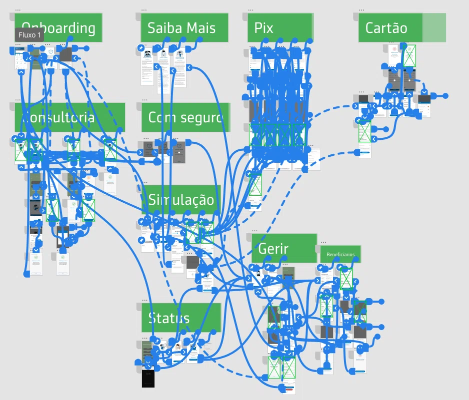
Insurance flow map connecting existing policyholders, new users, broker support, onboarding, approval stages, payment, and account access inside one product experience.
Not every digital flow should remove the human.
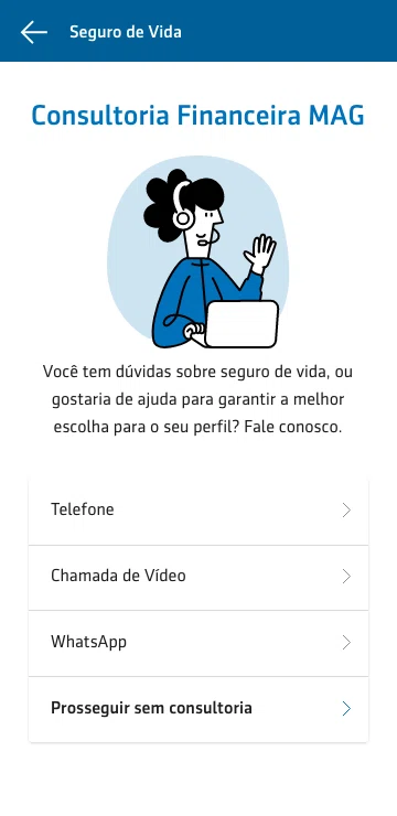
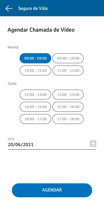
One product decision I still like is that broker support stayed inside the app. Instead of pushing users out of the experience, the flow gave them ways to call, message, or schedule a video conversation.
That kept the journey digital without pretending every insurance decision should happen alone. For this category, that balance felt important. Sometimes better UX is not removing the human step; it is making the human step easier to reach.
Broker contact and scheduling screens. The flow kept advisory support inside the app instead of treating it as an offline detour.
Returning users needed a more secure path.
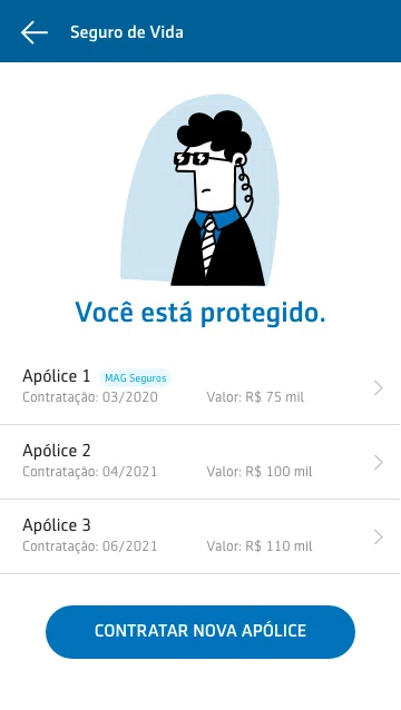
Existing customers had a different problem. They were not exploring the product; they were trying to access active policy information. That meant the flow had to be faster, more familiar, and more secure.
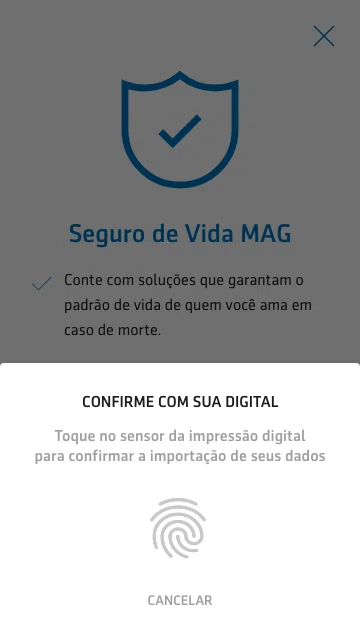
Biometric authentication helped reduce friction while keeping sensitive information behind a security pattern users already understood. The goal was not to make policy access feel casual, but to make it feel clear and controlled.
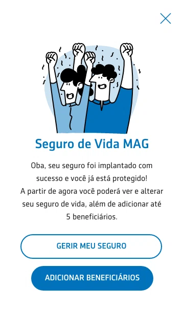
Existing-customer path for importing and accessing active insurance policies. Biometric authentication reduced friction without making sensitive information feel casual.
MAG Finances moved fast.
Less than a year after launch, MAG Finances supported R$500M in payment transactions. That milestone was reported as necessary for the company to pursue authorization from Brazil's Central Bank as a payment institution.
That context makes the design work feel heavier than “some app screens.” The product was part of a legacy insurance group moving into digital financial services, and it needed to earn trust from users, satisfy regulatory expectations, and still work as something people could actually use.
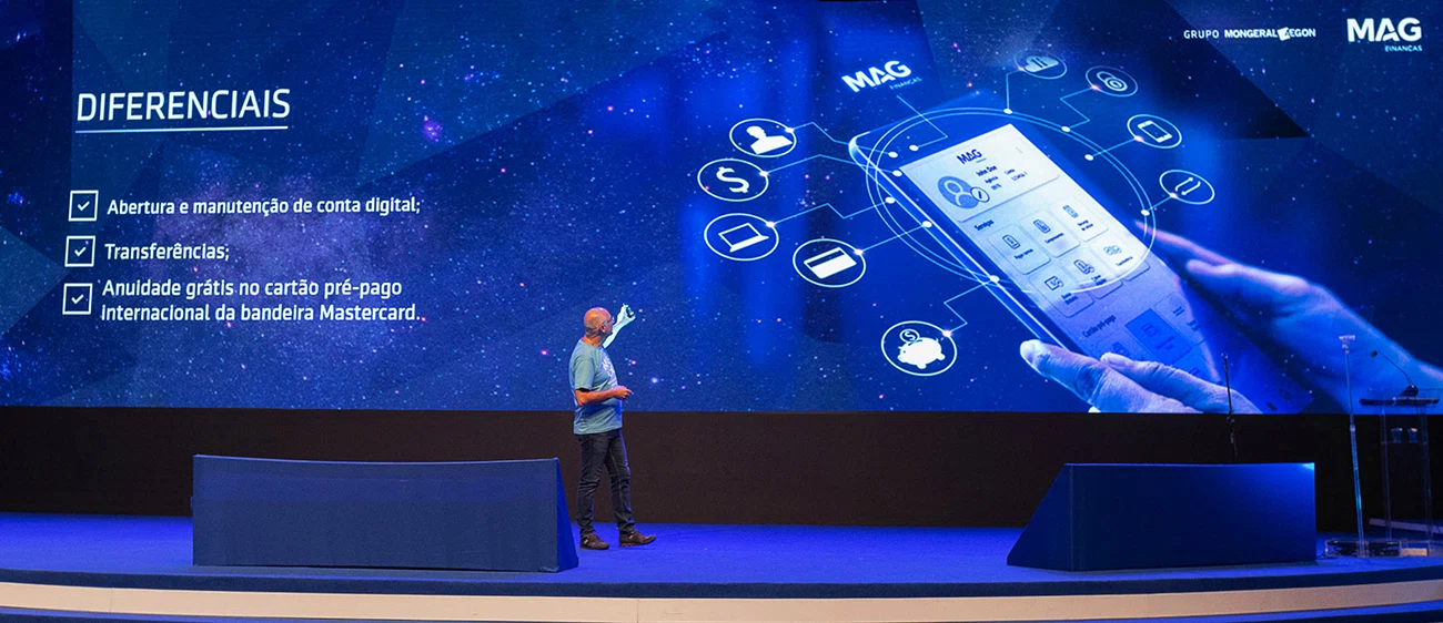
MAG Finances launch presentation, showing the product's role in Aegon Insurance's expansion into digital banking and payment services.
I helped make the system usable.
My role sat between product design, systems, accessibility, and research support. I contributed to the MAG-specific library, adapted inherited components for real fintech and insurance use cases, worked on accessibility considerations, supported user testing, and designed key screens and flows for the insurance journey.
The part I care about most is that the library was not just documentation. It became a working product tool: something the team could use to make decisions, not just something to point at after the decisions were already made.
The constraint was the work.
This project taught me that constrained design is not smaller design.
We had inherited rules, an existing visual system, banking expectations, insurance complexity, accessibility needs, user testing, and regulatory pressure. None of that disappears because the interface looks clean.
The job was to make the system flexible without making it loose, clear without making it childish, and modern without making it feel like it belonged to a different company. That was the real design problem: not inventing a new thing, but making the existing thing strong enough to hold a product it was never originally built for.
Sometimes the strongest design work is not the newest visual direction. It is making a constrained system actually work.