←︎ All case studies
Galoa Science: Helping attendees plan their conference day
A UI redesign for the Galoa Science attendee area, focused on making multi-track academic schedules easier to scan, compare, and organize without losing the event’s custom branding.
Interface Design
Schedule UX
Concept
TL;DR
Galoa Science’s attendee area needed to help congress participants organize their day across a dense, multi-track academic event.
The existing schedule showed information, but it did not do enough to help users compare sessions, notice conflicts, or move between a detailed list and a broader day view.
I redesigned the schedule experience around two complementary views: a chronological list for immediate decisions and a grid view for comparing rooms and time slots. The proposal also included session cards, conflict detection, and a color system flexible enough to support different event brands.
- Role
- UI Designer
- Project
- Galoa Science attendee area
- Project type
- Concept
- Context
- Academic event platform
- Scope
- Schedule interface · session cards · grid view · conflict detection · color system
- Key challenge
- Help attendees plan a multi-track conference day without losing flexibility for event-specific branding
- Output
- Semi-high-fidelity prototype · process deck · dual-view schedule proposal
The schedule was one of the most important parts of the experience.
The attendee area and agenda were central to the Galoa Science experience. This was where congress participants would find information about the event, organize their day, and choose which sessions they wanted to attend.
That sounds simple until you remember how academic events usually work. There are parallel sessions, rooms, categories, overlapping talks, long days, and people making decisions quickly between one thing ending and another thing starting.
There was also a branding constraint that had to stay. Event organizers could customize colors and banners, so the interface needed to be flexible enough to carry different event identities without losing its structure.
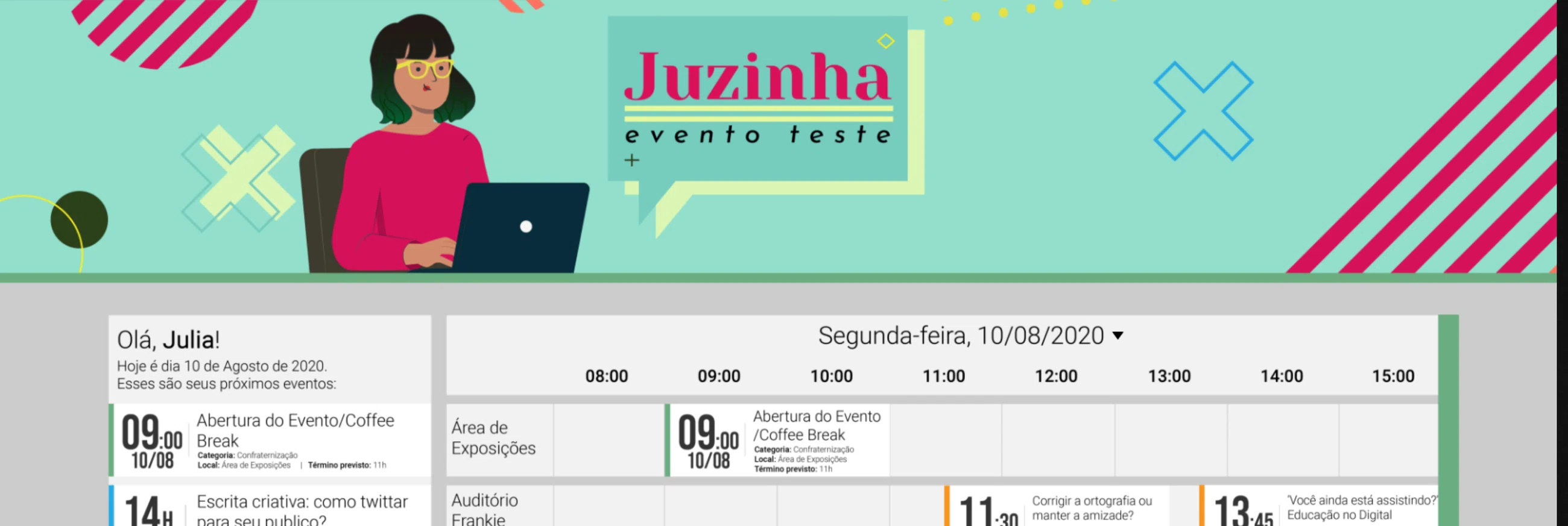
The original attendee area gave me the starting point: useful information was there, but the schedule needed to become easier to scan and plan around.
Capable people, very little patience.
The user was not someone who needed the interface to explain what a conference was. These were researchers, students, professionals, and attendees who could understand new tools, but did not have time to fight with them.
At an event, the interface has to respect attention. People need to know what is happening, where it is happening, when it ends, and whether choosing one session means missing another one.
The product also had a social layer. Some attendees go with colleagues, some share events professionally, and some use platforms like LinkedIn around academic work. Sharing was not the core need, but it made sense as a useful secondary action.
Paper first, because the problem was layout.
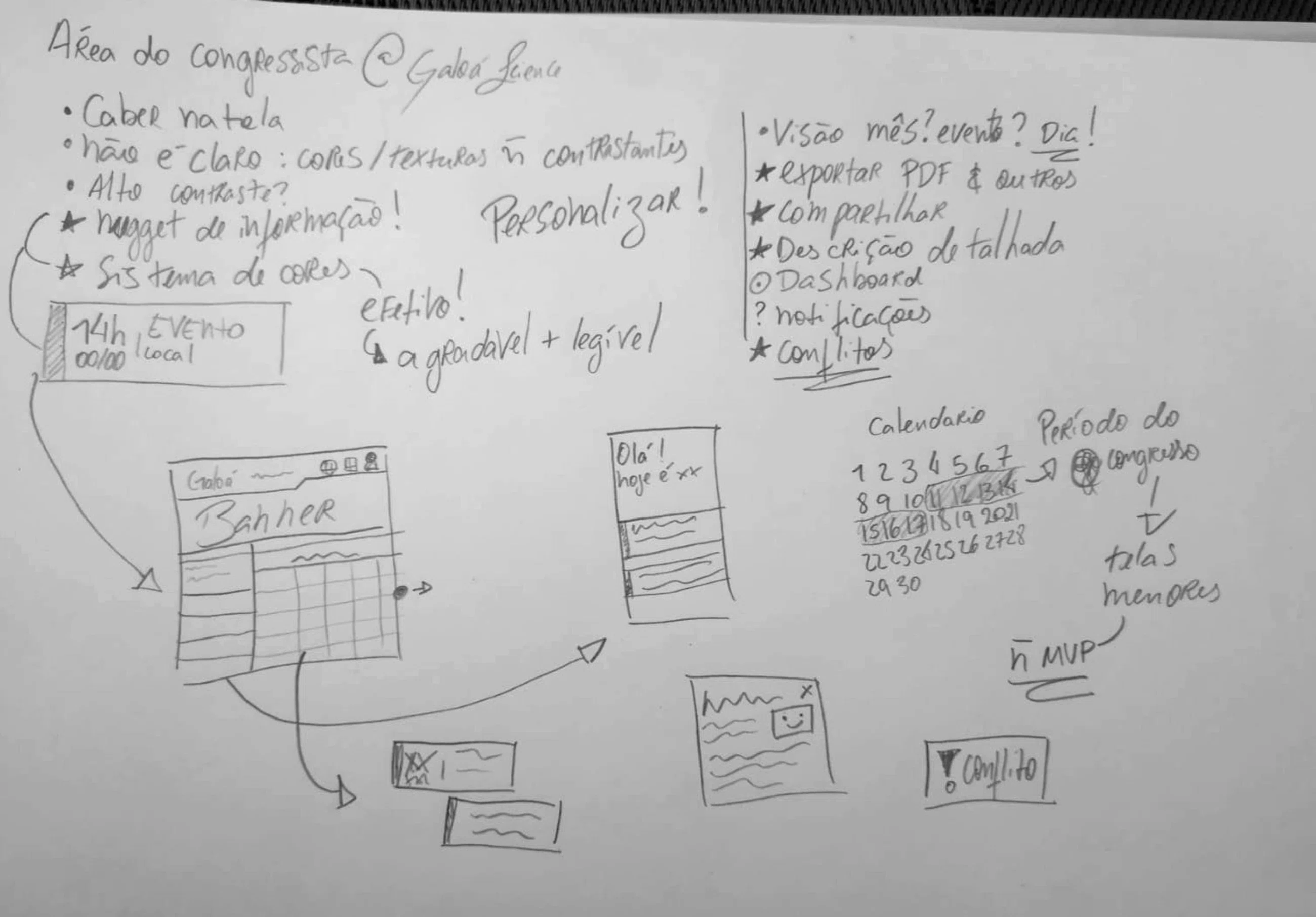
I started on paper because the hard part was not the visual style at first. It was the relationship between the list, the calendar, the rooms, the time slots, and the amount of information each session needed to carry.
The early sketches explored how much could fit on screen, how the user could move between a detailed list and a broader day view, and how the system could flag conflicts without making the interface feel noisy.
This was a quick project, so I was not trying to overbuild it. I wanted a simple structure that could show the idea clearly and still leave room for more testing later.
Early paper sketches exploring the relationship between the session list, grid view, time slots, filters, export options, and conflict warnings.
Two views for two different planning modes.
I redesigned the schedule around two complementary views: a chronological list and a time-based grid.
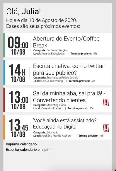
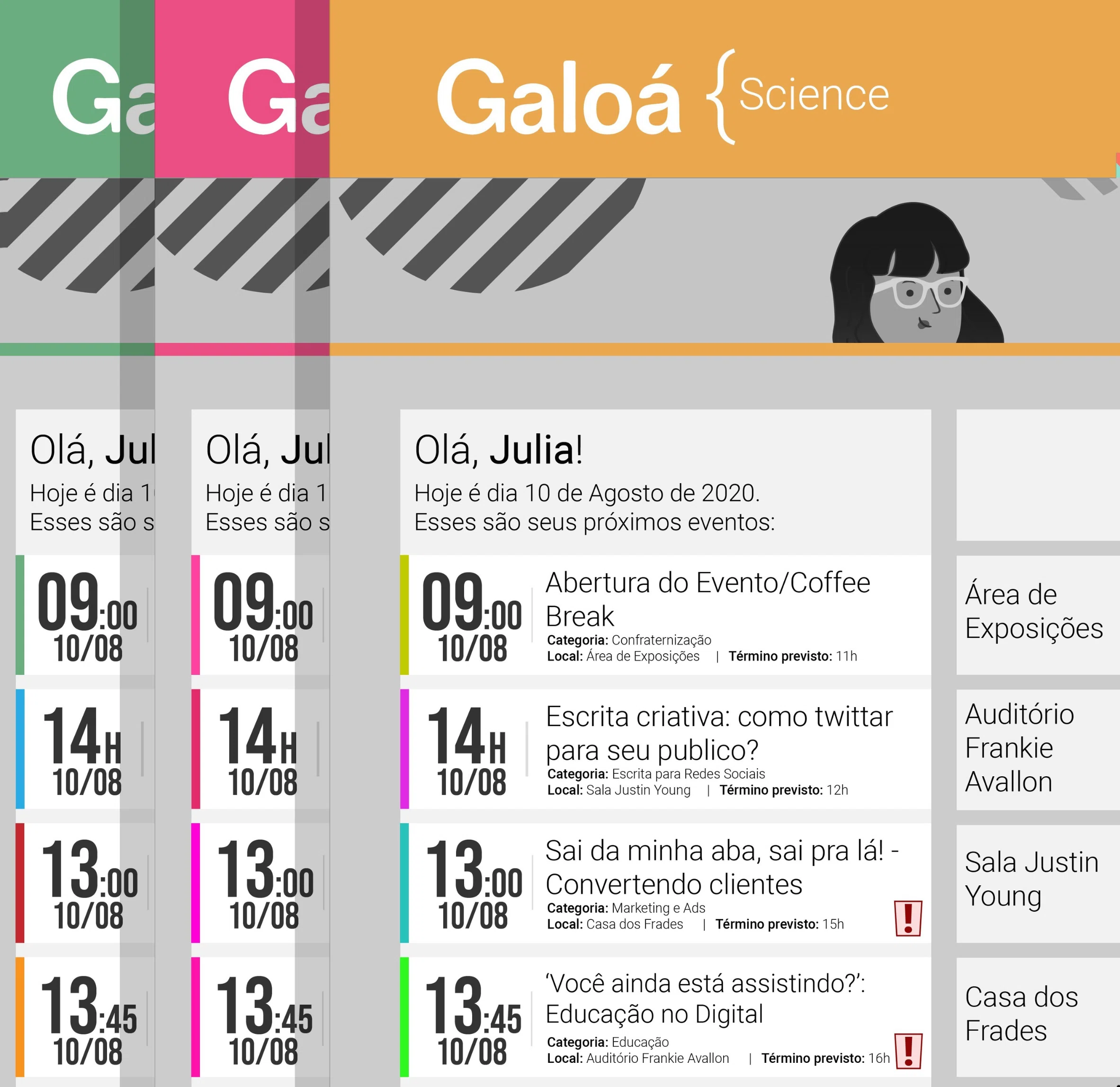
The list view was for immediate decisions. It used compact session cards, or “nuggets,” to show the essentials quickly: time, date, title, category, room, and expected end time. The goal was to give the user enough information to act without opening every session one by one.
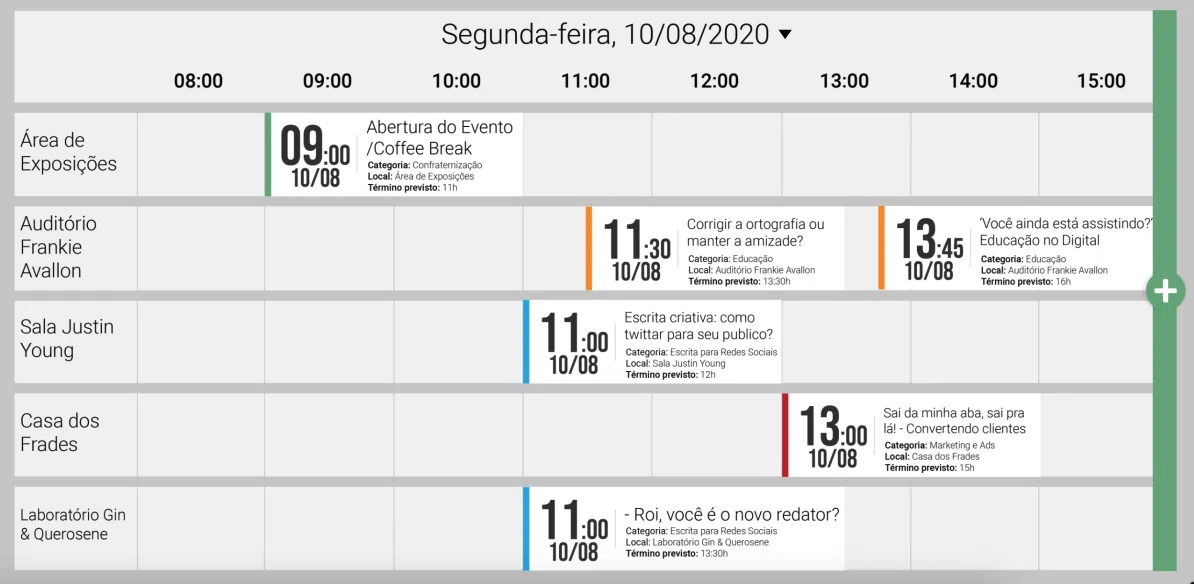
The grid view was for the bigger picture. Rooms became rows, time became columns, and the attendee could compare what was happening across the day. That mattered because multi-track events are less about finding one session and more about choosing between several possible versions of the same day.
Grid view with rooms as rows and time as columns, designed to help attendees compare sessions across the day.
Session “nuggets” grouped the essentials into a repeatable card pattern: time, title, category, location, and expected end time.
The interface should notice when the day does not fit.
One of the clearest additions was conflict detection. If an attendee added overlapping sessions to their list, the interface flagged the conflict directly where the decision was happening.
That matters because no one wants to manually cross-check every room and time slot during a conference. The point of the schedule is not just to display information; it should help users avoid planning a day that cannot physically happen.
The warning pattern was intentionally visible but contained. It needed to alert the attendee without turning the schedule into a wall of red errors.
Small pieces did most of the work.
A lot of the redesign depended on small interface decisions. The session cards repeated essential information in a consistent format so users could build visual memory as they scanned. The greeting area surfaced the current day and upcoming sessions, almost like a quiet assistant telling the attendee what mattered next.
I also worked on interaction details such as opening a session for more information, adding it to the user’s list, receiving notifications, sharing, and exporting the calendar. None of those actions needed to dominate the page, but they had to be available when the attendee needed them.
The goal was to make the interface feel helpful without becoming loud. In a conference schedule, clarity matters more than decoration.
Grey carried the structure so event colors could change.
Because event organizers could choose their own colors and banners, I could not design the interface around one fixed palette. The system had to survive different event identities.
Grey became the structural anchor. It carried the calendar grid, hierarchy, and background rhythm, while event colors could sit on top as accents for categories, banners, and identity moments.
That made the interface more adaptable. The goal was not to make every event look the same, but to make sure every event stayed usable.
Color tests showing how the same schedule structure could hold different event palettes without losing hierarchy.
A simple prototype was enough to prove the direction.
Because the project had a short timeline and still needed more research and testing, I treated the final version as a semi-high-fidelity prototype rather than a finished product.
That was the right level of fidelity for the moment. It showed the core structure, the two schedule views, the session cards, the conflict pattern, and the customization logic without pretending every edge case had already been solved.
If I had more time, I would test it with real event attendees, especially around filtering, mobile behavior, accessibility, and how people decide between overlapping sessions during an actual conference day.
The schedule became a planning tool, not just a calendar.
The strongest part of this project was the shift from showing events to helping people plan around them.
A scientific conference schedule is not just a list of talks. It is a decision-making space. Attendees are comparing time, room, relevance, conflicts, and energy across a day that is already busy.
The redesign kept the event branding flexible, but gave the schedule a clearer structure underneath it. That structure is what made the interface more useful: easier to scan, easier to compare, and less dependent on the user holding the whole day in their head.
The calendar was already showing information. The redesign made it help.
English PDF · original project archive
Original prototype in Portuguese