Casa das Palmeiras: Making a nonprofit easier to find and support
A volunteer UX/UI and communication project for Casa das Palmeiras, a Rio mental health institution founded by Dr. Nise da Silveira. The work focused on making the mission, donation paths, volunteer information, and history easier for new visitors to understand.
Information ArchitectureCommunication StrategyNonprofit
TL;DR
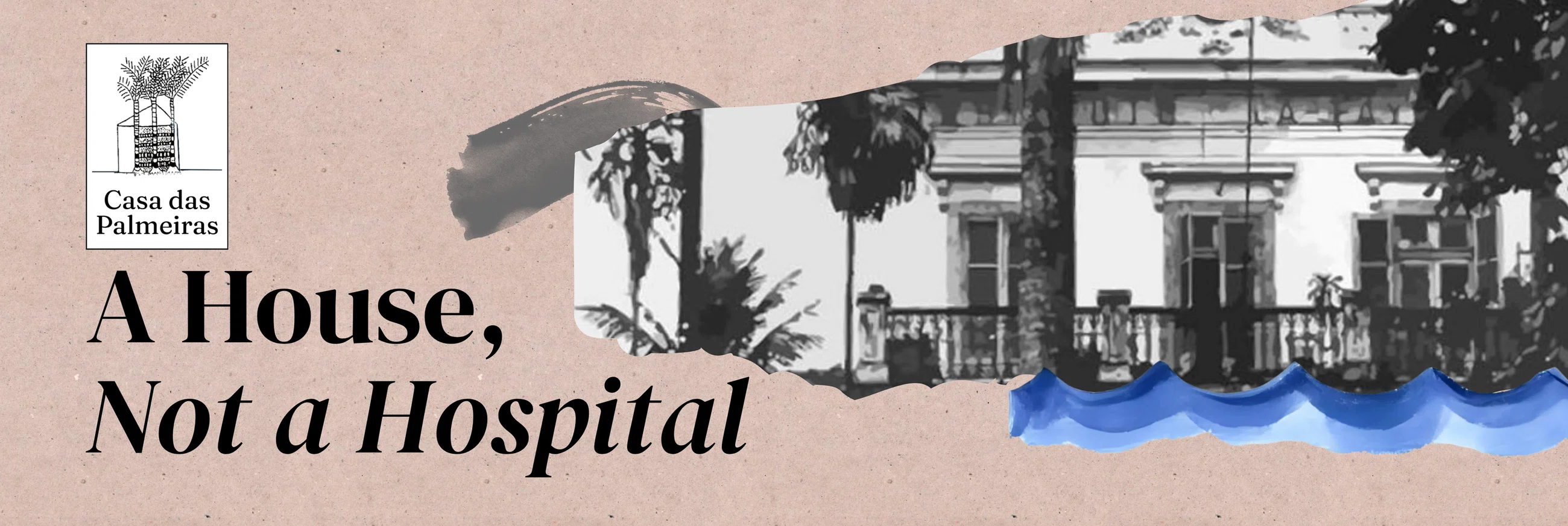
Casa das Palmeiras website redesign proposal. The goal was not to erase the organization's history, but to make it easier for people to enter it.
Casa das Palmeiras already had a powerful history, meaningful work, and important information online. The problem was that new visitors had to dig through an old Blogspot structure to understand the mission, find donation information, or figure out how to volunteer.
I tested the existing site with 10 people, found six recurring friction points, and proposed a clearer website structure supported by donation paths, volunteer information, client artwork, and a platform-specific social media strategy.
Role
UX/UI Designer · visual communication
Organisation
Casa das Palmeiras
Focus
Findability · donation paths · volunteering
Key metrics
1956 Founded · 6 Friction points · 3 Social platforms
Scope
Website structure · donation flow · volunteering · social strategy
Key challenge
Make existing information easier to find, understand, support, and share
Output
Homepage redesign proposal · clearer information architecture · social media strategy for LinkedIn, Twitter/X, and Instagram
The story was strong. The website was not helping it.
Casa das Palmeiras was founded in 1956 by Dr. Nise da Silveira, a Brazilian psychiatrist known for defending humane mental health treatment and using art as part of psychiatric care.
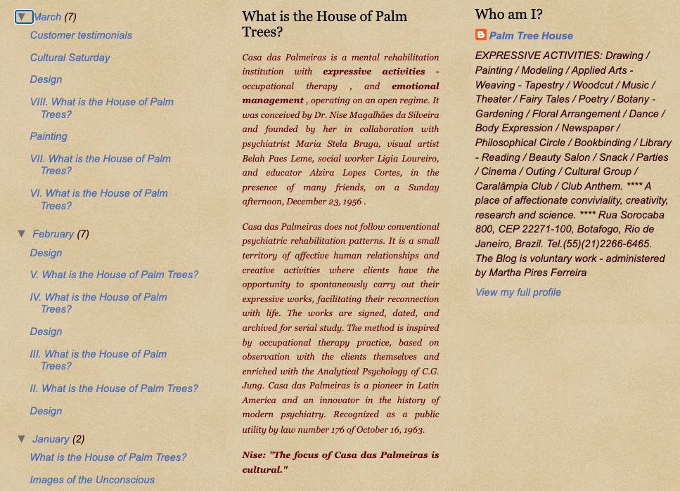
That history matters, but on the old website it was hard to reach. The organization's online presence lived on a Blogspot page with a default theme, long posts, scattered links, and very little hierarchy. There was meaningful content there, but visitors had to work too hard to understand what Casa das Palmeiras did, why it mattered, and how they could help.
For an organization that depends on donations, volunteers, and public understanding, that was not just an aesthetic problem. It was a findability problem.
The original Blogspot site used a default structure with little hierarchy, which made important information feel buried even when it technically existed.
People wanted to help, but the site made them hunt.
I tested the existing site with 10 people who did not already know Casa das Palmeiras. The tasks were simple: understand what the organization does, find out how to donate, and find out how to get involved as a volunteer.
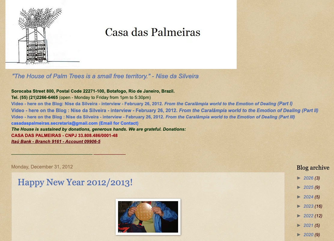
Those tasks should not have been difficult, but they were. Participants could usually find fragments of the answer, but rarely the full path. The mission was buried in old posts, donation information appeared as a bank account number inside dense text, volunteering was mentioned without a clear path, and Dr. Nise's story was spread across disconnected links that felt more academic than welcoming.
The issue was not that the information did not exist. It was that the site treated every piece of content as if it had the same priority, so visitors had to assemble the story themselves.
Donation information was technically present, but buried inside a text-heavy page. For a visitor trying to help quickly, that is almost the same as not finding it.
Structure first. Then visibility.
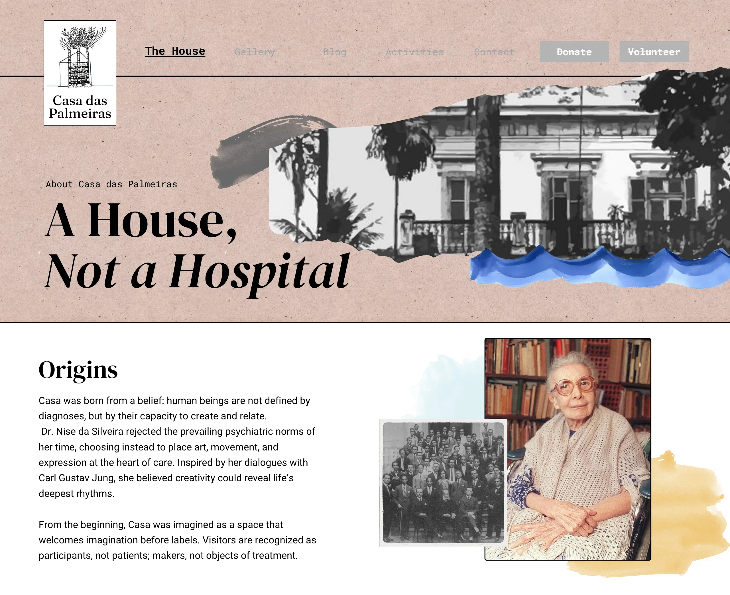
The redesign started with information architecture, not decoration. I reorganized the homepage around the things a new visitor would need first: what Casa das Palmeiras is, who Dr. Nise was, how art connects to the institution's work, how to donate, and how to volunteer.
I proposed a clear navigation bar, dropdown menus, visible calls to action, and a homepage that used client artwork as a central visual element. The artwork was already one of the strongest parts of the organization's identity, so hiding it deep in the site made no sense.
I did not approach this as a full rebrand. Casa das Palmeiras did not need to become a shiny new thing; it needed a clearer way for people to understand and support what was already there.
The redesigned homepage proposal brought artwork, mission, donation, and volunteer paths closer to the surface, instead of making visitors dig through old posts.
Two of the most important visitor actions were also two of the hardest to complete: donating and volunteering.
For donations, the old site relied mostly on a bank deposit number embedded in text. I proposed making donation paths visible from the homepage and expanding the options so support did not depend on someone copying banking information from a paragraph.
For volunteering, the problem was similar. The information existed in pieces, but the site did not treat it as a primary path. The redesign made volunteering part of the main structure, so someone who arrived wanting to help would not need to read the entire archive to figure out where to start.
This was not about pushing users into conversion funnels in the startup sense. It was about respecting the intent they already had when they arrived.
The same story could not be posted the same way everywhere.
The communication strategy extended beyond the website because Casa das Palmeiras had different audiences in different places. A researcher, a potential donor, a volunteer, and someone discovering Dr. Nise through culture would not all enter through the same door.
For LinkedIn, I designed an editorial carousel focused on the institution's history and Dr. Nise's importance, speaking more directly to professionals, researchers, and potential institutional supporters.
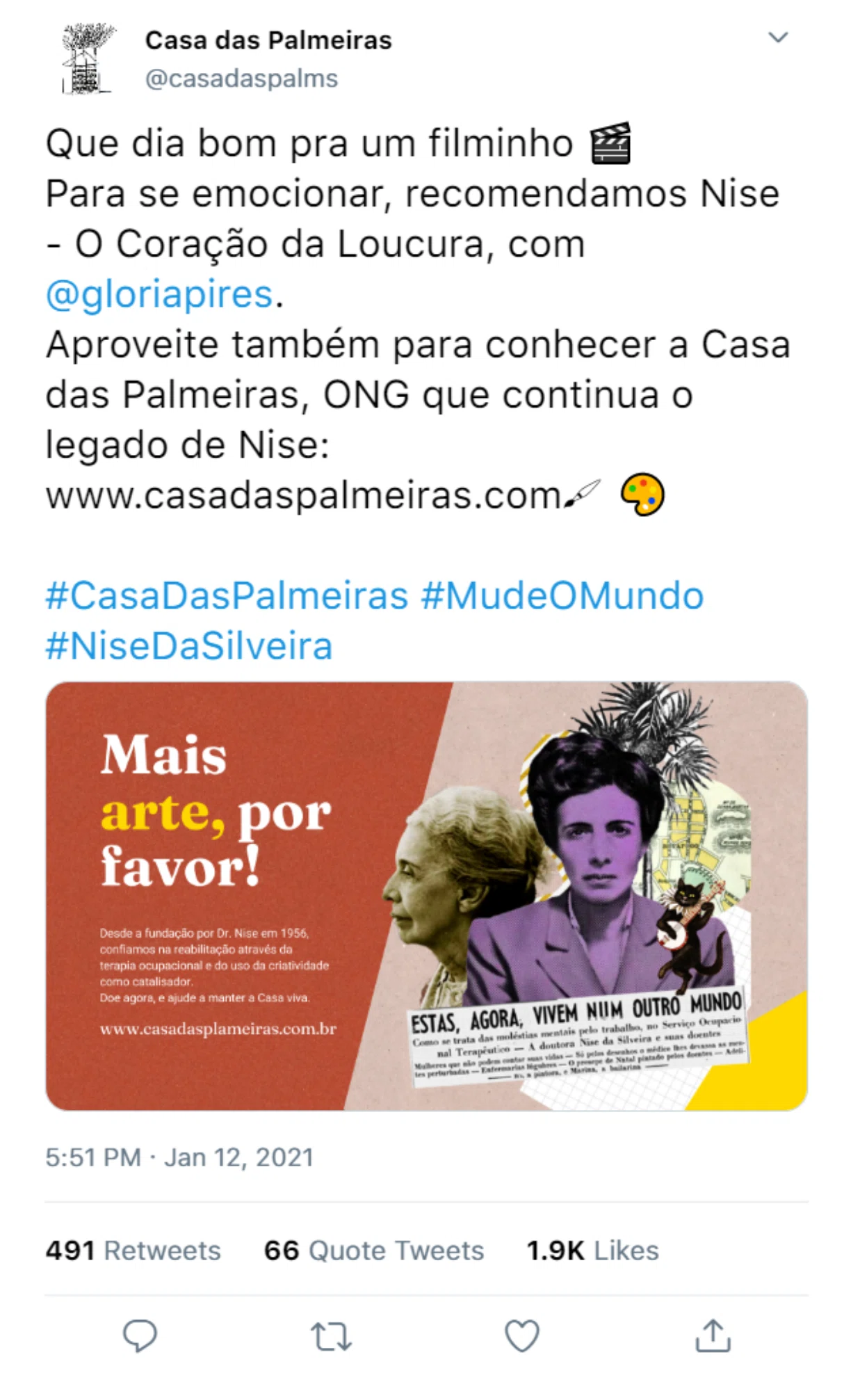
For Twitter/X, I used a cultural hook that already existed: the film Nise: O Coração da Loucura. It gave people a familiar entry point into a story that could otherwise feel distant or academic.
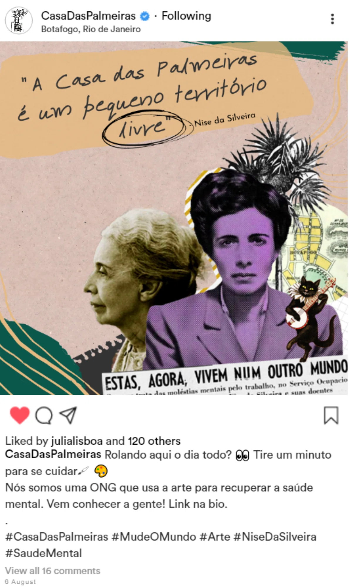
For Instagram, the tone became more visual and intimate, using archival photographs and client artwork in a way that felt closer to a person sharing the institution's story than an organization making an announcement.
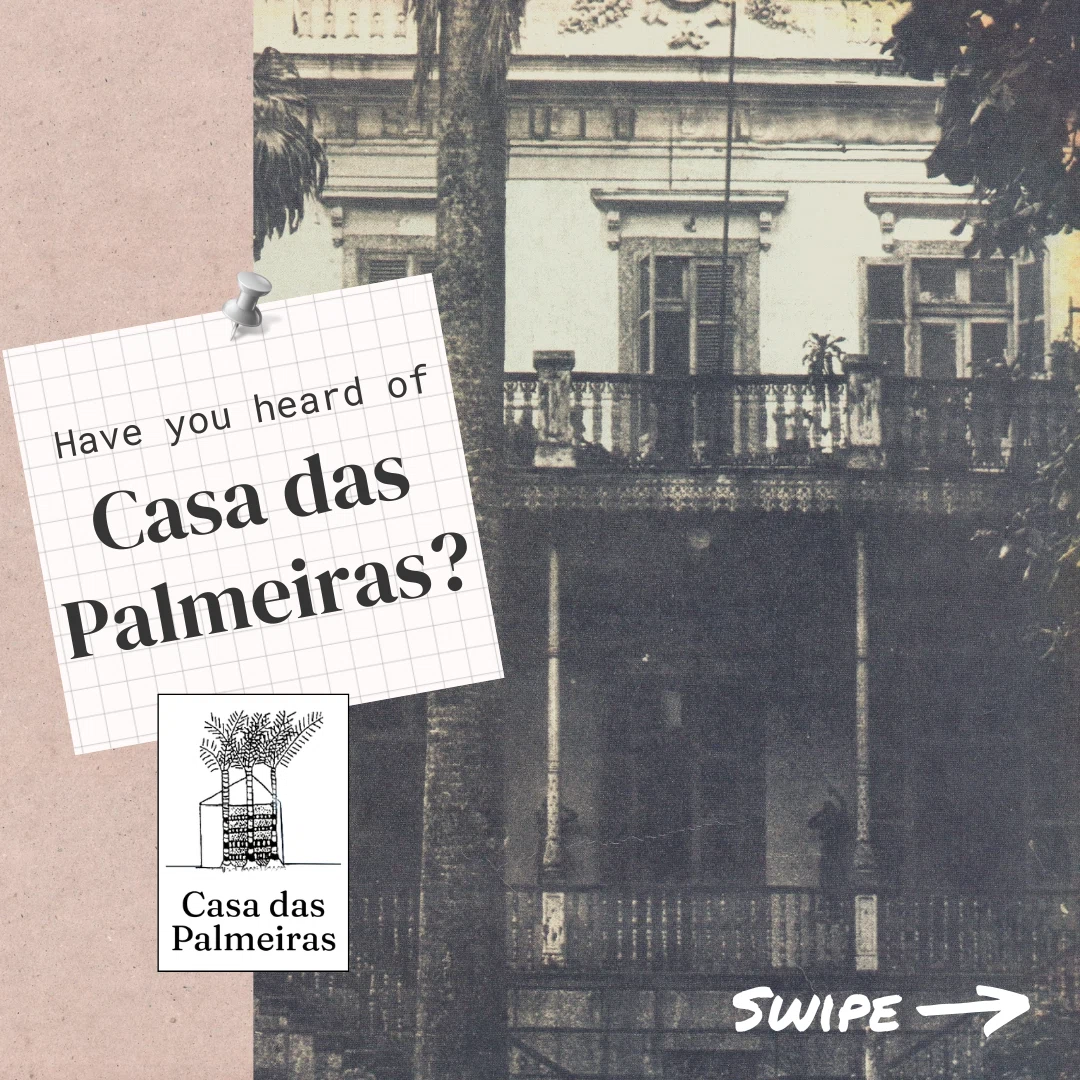
LinkedIn carousel focused on Casa das Palmeiras, Dr. Nise da Silveira, and the institution's relevance for professional and institutional audiences.
Twitter/X post using Nise: O Coração da Loucura (Nise: The Heart of Madness, 2015 film) as a cultural entry point. Post content in Portuguese; the copy recommends the film and invites people to learn about Casa das Palmeiras, the nonprofit continuing Nise's legacy.
Instagram concept using archival photos, client artwork, and a quote from Nise da Silveira: “Casa das Palmeiras is a small free territory.” Post content in Portuguese; the caption introduces the organization as an NGO that uses art to support mental health recovery.
The content was already there. The path was not.
The redesign did not invent a new story for Casa das Palmeiras. It made the existing one easier to enter.
The old site had history, donation information, artwork, institutional context, and volunteer mentions, but those pieces were scattered across posts and pages without a clear hierarchy. The proposal reorganized them around the questions real visitors had: What is this place? Why does it matter? How can I help? Where do I go next?
That kind of work can look simple when it is done, but it matters. For small organizations, unclear structure turns into lost support, lost attention, and unnecessary friction for people who were already willing to care.
Not every project needs a louder identity.
Casa das Palmeiras did not need to become louder, trendier, or more polished for the sake of it. The organization already had a powerful history and a visual language rooted in the artwork of its clients.
The design problem was more basic and more important: make the mission understandable, make the support paths visible, and make the archive feel like a door instead of a maze.
That is the part I still care about in this project. Sometimes the most useful design work is not adding more. It is putting what already exists in the right order.
The story was already there. I helped make it easier to find, understand, support, and share.