TL;DR
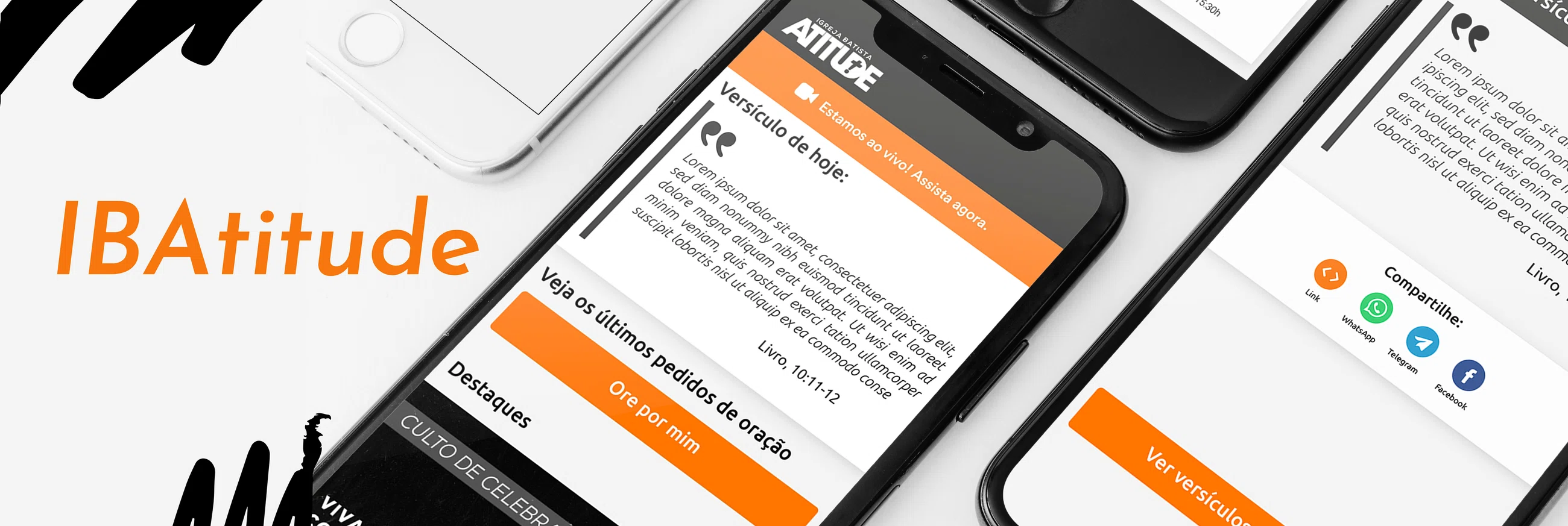
IBAtitude mobile app redesign proposal. The goal was to make the home screen feel less like a content archive and more like a reason to return.
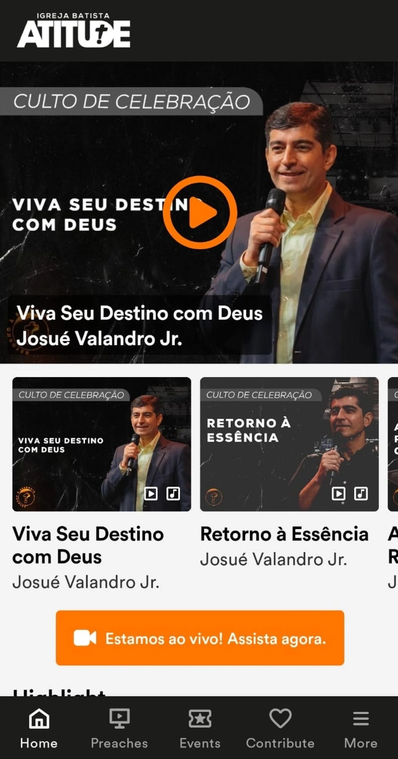
IBAtitude had valuable content, but users were not returning to the app after creating an account. The home screen was dominated by long sermon videos, which made the app feel more like a content archive than a daily community tool.
I proposed three targeted home-screen changes to support repeat use without rebuilding the whole app: a daily Bible verse, a prayer request flow, and a functional events calendar.
- Role
- UX/UI Designer
- Project type
- Concept
- Focus
- Retention · daily engagement
- Key metrics
- 3 Home-screen features proposed · 1 Daily engagement loop · 2 Community support paths · 1 Events calendar rebuilt
- Scope
- Home screen redesign · feature strategy · prayer requests · daily verse · events calendar
- Key challenge
- Give users small, meaningful reasons to return between church services
- Output
- Mobile home screen proposal · daily verse feature · prayer request flow · functional events calendar
The app had content. It did not have a habit.
IBAtitude already had meaningful content for its community. The problem was that the app did not give users enough reason to return after creating an account.
The home screen was heavily focused on long sermon videos. That content had value, but it also made the app behave more like a storage place for media than something people would naturally open during the week.
The client wanted a redesigned home screen focused on retention. The question was not “how do we add more content?” It was “what would make someone come back?”
The audience was already social and mobile-first.
The target audience was young, evangelical, and mobile-first: people roughly between 18 and 25 who were already used to sharing thoughts, faith, events, and daily life through digital platforms.
That mattered because the app did not need to teach them how to use mobile features. It needed to give them features worth returning to.
The strongest opportunities were not complex. They were small, repeatable, and tied to behavior that already existed in the church community: reading scripture, asking for prayer, attending services, joining events, and sharing meaningful content with others.
Long videos were doing too much of the work.
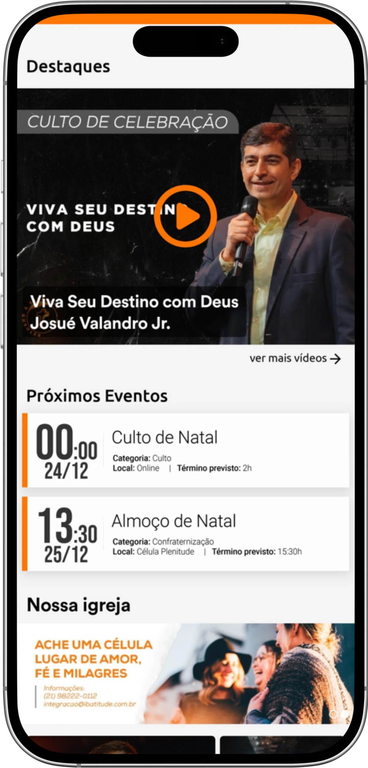
The home screen depended too much on sermon videos as the main engagement driver.
That created a mismatch. Long videos can be useful when someone has time and intention, but they are not always the best entry point for a quick daily visit. They also competed with platforms like YouTube and Facebook, where video content already lived naturally.
If the app only repeated content users could find elsewhere, it became easy to forget. To support retention, the home screen needed lighter reasons to open the app between services.
Three small changes, not a full rebuild.
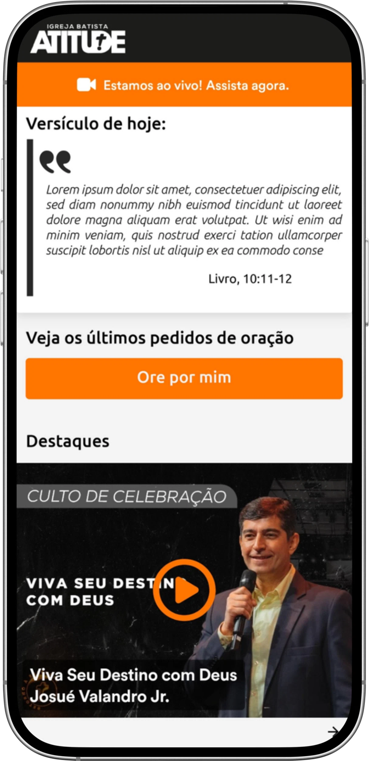
I proposed three home-screen additions: a daily Bible verse, a prayer request feature, and a functional events calendar.
The idea was not to redesign the entire app from scratch. It was to give the existing product a clearer rhythm. Each feature answered a different retention need.
The daily verse created a simple recurring reason to open the app. Prayer requests made the community feel active beyond physical meetings. The events calendar gave users a practical reason to check what was coming next.
Together, the features moved the home screen away from passive content browsing and closer to daily participation.
The redesigned home screen introduced smaller, more frequent engagement points around scripture, prayer, and upcoming events.
A small reason to open the app every day.
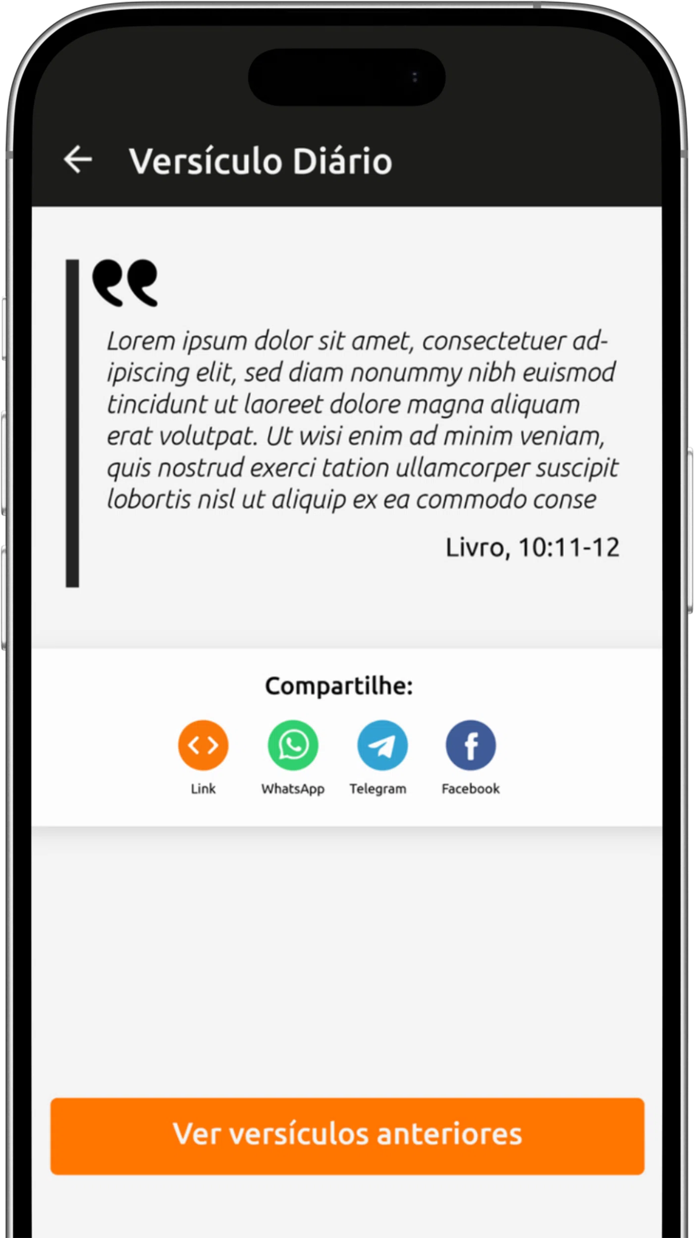
The daily Bible verse was designed as the simplest recurring touchpoint.
It gave users something quick to read, reflect on, and share without needing to commit to a long video. The feature could also support notifications, previous verses, and future reflections from church leadership.
This mattered because retention does not always come from bigger content. Sometimes it comes from a small action that fits naturally into someone's day.
Daily verse feature designed as a lightweight recurring touchpoint, with room for sharing, notifications, and previous verses.
Community should not depend only on being in the building.
Prayer is already a familiar behavior inside church communities, so the feature did not need to create a new habit from nothing. It translated an existing behavior into a digital path.
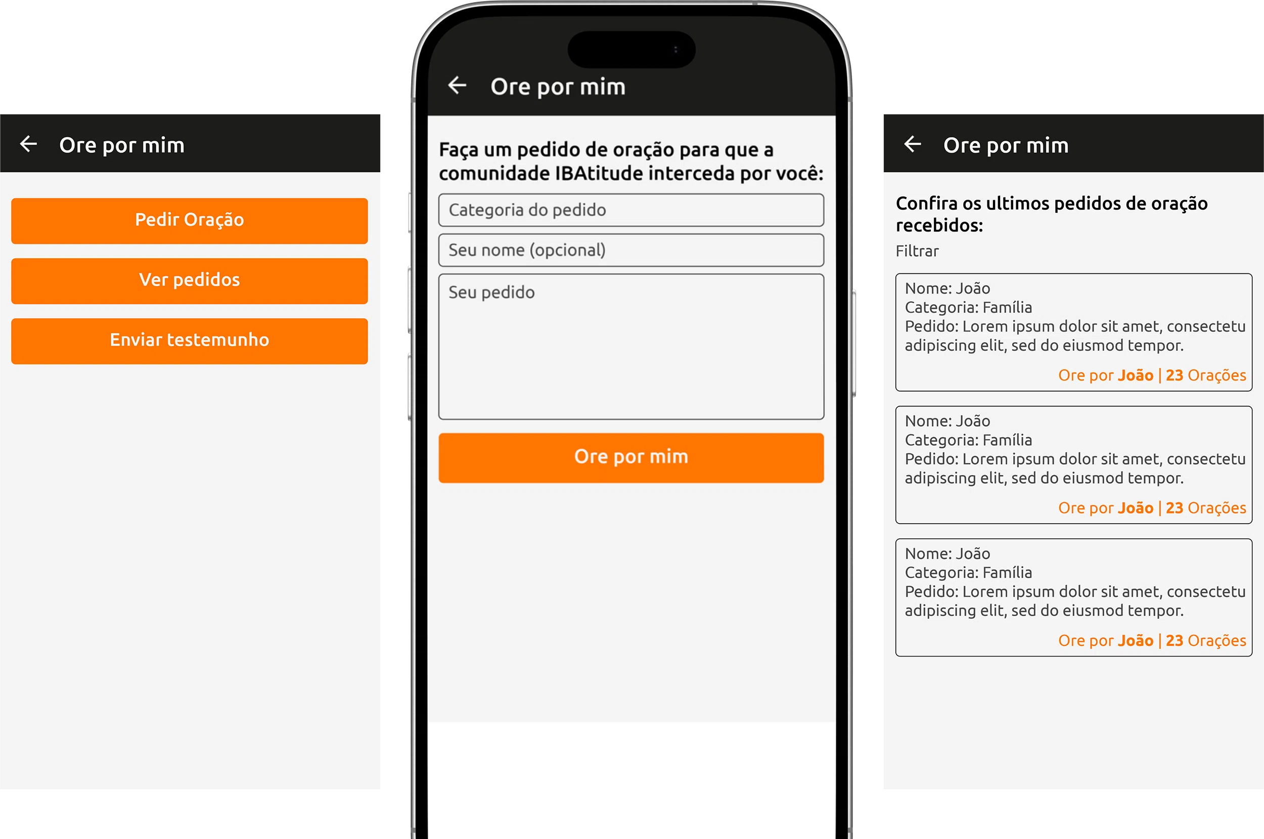
The prayer request flow gave users a simple way to ask for support, especially when they could not be physically present or did not feel comfortable asking in person.
This was especially relevant in a context where community connection could not depend only on services, meetings, or face-to-face moments. The app had an opportunity to support care between those moments.
Prayer request flow designed to make community support easier to access between services and in-person meetings.
The empty events tab needed a job.
The app already had an events area, but it was not doing enough work. If users opened a calendar and found little or nothing useful there, the feature taught them not to check again.
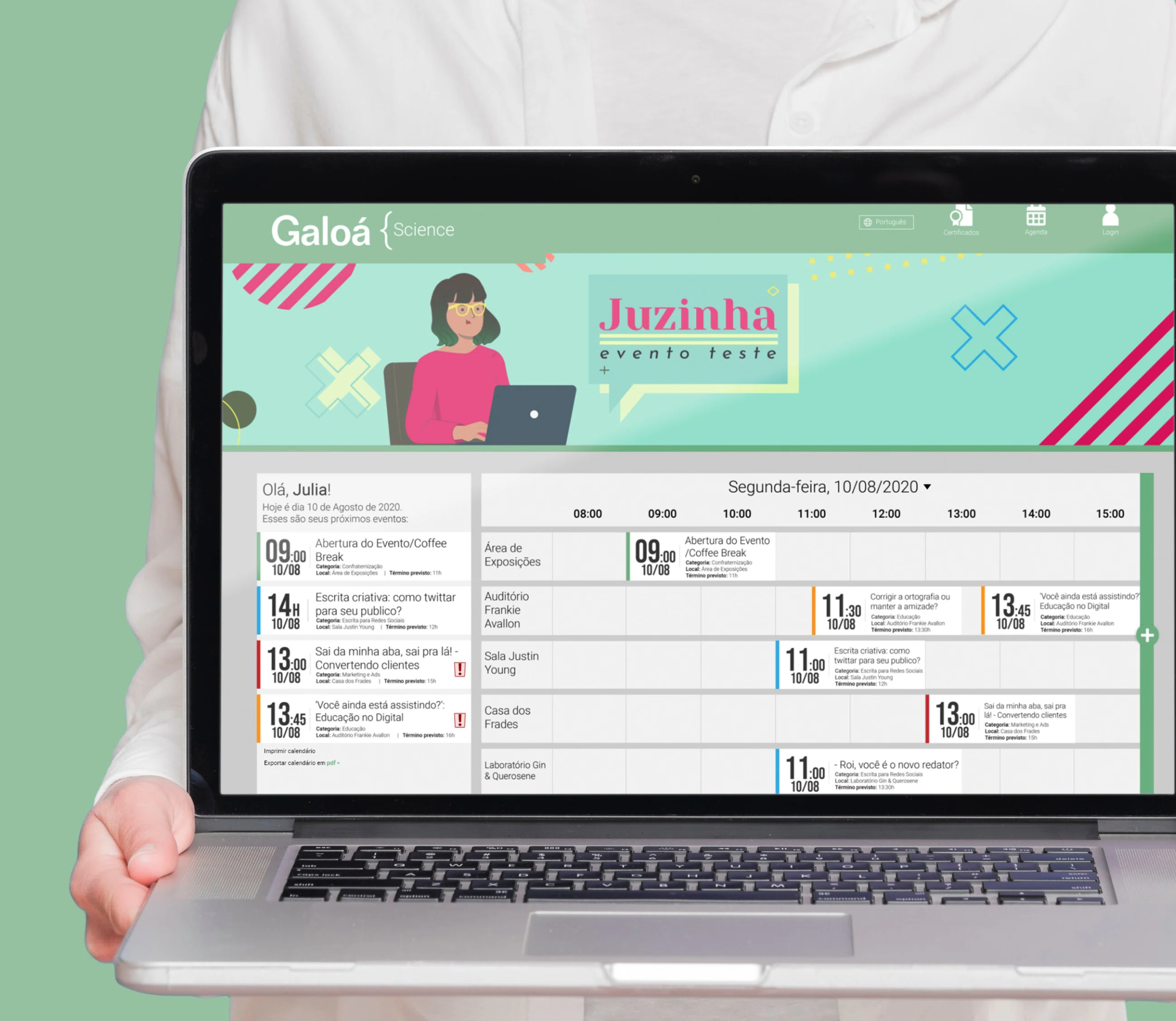
I proposed making events a more functional part of the home screen. Services, live streams, special content, youth events, and church activities could be surfaced clearly, with the option to add them to the user's own calendar or receive reminders.
The calendar was not just an organizational feature. It was another reason to return.
Events calendar proposal designed to surface upcoming services, live streams, and church activities more clearly.
The home screen became less passive.
The redesign shifted the home screen from a place where users consumed content to a place where they could participate.
That shift mattered because the retention problem was not solved by adding more media. The app needed a stronger daily role in the user's life. The proposed features gave it three: reflection, support, and planning.
None of those ideas required the product to become more complicated. They made the home screen more useful by connecting it to behaviors the audience already understood.
Retention does not always need a big feature.
The strongest opportunity in IBAtitude was not a dramatic rebuild. It was a better home-screen rhythm.
A daily verse, a prayer request flow, and a functional calendar are not flashy ideas, but they answer a real product problem: why would someone open this app again tomorrow?
That is what made the proposal useful. It respected the existing content, but stopped asking long videos to carry the whole experience.